GRAPHIC DESIGN
Take a look at the great work produced by the Graphic Design students at NTIC, displaying their creativity, skills and knowledge in the field of graphics. Their works range from logos and packaging design to design of loyalty cards and menus.

STUDENT WORK
Wiranchana Ratanasirisawad
Graphic Design
The Pudding Pantry
I am interested in the visual design such as font and pattern but some times I want to push through to my limit so I will keep doing more practical work and decrease some work that I do it by digitally.The main brief of this project is to redesign the branding of Nottingham local cafe, bar or restaurant. The title of my project is called The Pudding Pantry, I decided to choose the dessert cafe located near the corner house which I have picked the theme that related to the ingredient of almost every pudding may have. My project aim is to design the branding by using more than one art movement, the intended audience for my project is Nottingham people who are interested in the pudding and target customer of Pudding Pantry such as adult, family and elder. The main purpose of the project is to represent Nottingham landmark because I want to combine the place with some of the colours that I will pick from a characteristic of pudding. Furthermore, the style of my design can be described as pop art and minimalism because I usually use flat colour and decrease some of the lines. I mostly do this project in digitally by Photoshop and Illustrator program, however, I also try to experience with more practical work so I choose watercolour to be one of the parts in my project due to the texture, transparency and it easy to make a gradient


Matilda von Borries
Graphic Design
Redesigning Doughnotts
The purpose of my project was to redesign the logo, loyalty card, packaging, business card and also to create a menu for the doughnut shop Doughnotts. The idea of redesigning Doughnotts started when I noticed it’s current design didn’t quite represent the origin or product of the shop. I feel a brand’s identity needs to be strongly connected to their surroundings and what they offer so I decided to incorporate a popular Nottingham site to the new design. I also researched three artists works, Hue Studio, Autumn Studio and Eugenia Zakharova. This research led me to choose pastel pink as my main colour since most of the logos they designed for shops used pastel colour palettes which made the designs more eye catching. Finally, The culture and colour were the main influences in this redesign, also keeping it simple and elegant with the font. This task was a great way to learn about the principles of graphic design and realizing that your creations need to be based on research and analysis.


Peiyun He
Illustration
The Unknown Side of China
My project name is called The Unknown Side of China. My chosen brief for my project was to redesign a tea packaging and the key theme of my project was to spread Chinese traditional culture. I used elements from Peking opera and Chinese mythical creatures to design the graphic of packaging. Because I like those kinds of Chinese traditional culture and I want more and more people can notice them. The Whittard’s Alice tea packaging inspired me to use watercolor as the surface design. An online design for ‘Shan Hai jing’ inspired me that I can use different characters from ‘Shan Hai Jing’ as the graphic design of small boxes. Then I made a story and an illustration by toner for the Spring Festival because the Spring Festival is one of the most important traditional festivals in China and it has a story about mythical creature. In storybook, there is a boy who keep a cup of tea that is link to the tea brand and storybook can be eye-catching on atrract new consumers and interest people in knowing Chinese traditional culture.


Vasilina Kuchumova
Graphic Design
Aloe Vera Drink Design
My project is called Aloe Vera Drink Design and it is aimed at redesigning the branding of the existing OKF’s Aloe Vera drink. I intended to keep my design minimalistic and simple as I personally find the style of Minimalism suitable for most people’s busy everyday life. One of the main inspirations for this project was the nature of aloe vera plant, its beautiful appearance and an immense amount of beneficial elements in it. My design was also influenced a lot by the works of the artists AG Fronzoni and Sol LeWitt.


Jannah AlMasoud
Graphic Design
The Coloured Streets
My Project is called The Coloured Streets and its purpose is to redesign the logo and graphics of an existing smoothie brand Innocent. I have intended to make the labels of the product more colourful with more attractive graphics that will fit different themes of the drinks. The theme of graphics I have worked on will show a special variety of designs for celebrated seasons like Halloween and Christmas on the labeling.One of my main inspirations towards this project was colours. I was interested in how colours persuade the buyer and create an aura towards the viewer.My designs were influenced by the works of artists John Maeda, Philip B Meggs and Marta Veludo


Kamilia Badgieva
Graphic Design
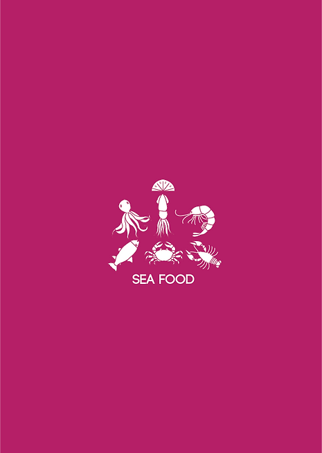
U Canteen
I believe that a cafe with a high rating must have good branding and corporate identity. Only then it can reach a new level and become popular not only in the city, but throughout the country. U Canteen is the type of restaurants that serve delicious food, but have a very poor design. That is why I chose it in order to make a redesign. U Canteen is a Chinese restaurant in Nottingham with homemade food and a cozy atmosphere. The goal of my project was to establish a strong recognizable identity in order for U Canteen to stand out from competitors and attract more customers. While working on the project, I was inspired by several designers in order to get the result that I wanted. My design explores the concept of showing food cooked with love and demonstrates this through visual communication.
.jpg)
.png)
.png)
Jiaxin Gao
Illustration
Onken Yoghurt
My interests are drawing and playing computer games, and I have been painting animated characters since childhood. I have been playing league of legends for 6 years. Also, I like to design some things include meaning which will make the things more interesting. My project contains German culture in terms of architecture and festivals. From my research, I got ideas from a Chinese yoghurt, Javier Mariscal and Google Doodle. Chinese yoghurt gave me an idea to combine the main colours and buildings of a place. I learned to draw the scenery on each letter from Javier Mariscal. Also, I broke through the shape of the letters and started to be creative which inspired by Google doodle. In my project, the problem with Onken yoghurt is the packaging is not related to its place of the original. Overall, I want to redesign its packaging combine with German culture so that it can promote the culture of the birthplace.


Zhiying Chen
Graphic Design
Xia Guan Tuo Tea
My aim in this project is to explore the theme of introducing a traditional Chinese tea that is taken black without any milk and is suitable for older people in China. This project reshapes the visual identity of the brand in a young and modern design language and tries to expand the consumer group from the middle-aged elderly to the young. The design is based on the traditional craftsmanship of Xia Guan Tuo Tea. The production process is presented in painting, because the brand still inherits the craft to carry forward the tradition, and attaches great importance to it to display its brand features and core to consumers.


Layali Alkanderi
Graphic Design
Redbull reincarnation
In regards to my statement of intent, I will be redesigning the logo of the energy drink known as Red Bull. I chose to redesign the packaging and the logo of Red Bull because even though the company claims on their website that it's sustainable and eco-friendly, they don't show that on the product itself. The redesigning will include changing the visual aspects of the product which includes how the customer responds to the design and advertised into a more eco-friendly style in order to promote sustainability. By turning the product packaging into something that encourages recycling, sustainability and reusing the can that the product comes in, a cardboard package is also an option as it's not as harmful to the environment as plastic or other material is normally used in the making of caffeinated drinks.
Prior to the redesigning, I'm going to be completing research on similar product ranges, for example, the energy drink Lucozade and Monster. In addition, I’m researching products or drinks which promotes sustainability already and their successes, I’m going look at the packaging, the graphic design used and how it's advertised. Regarding graphic design, I will be analysing techniques and skills used in the process as well as how the logos have been developed as Red Bull's logo designs have always been associated with power and energy. Moreover, comparing different products that can be found in supermarkets that are similar to find the perfect combination of graphic design that promotes sustainability for my final product. Adverts used for promoting the original product are also important, such as a variety of ways of promoting the product including tv ads, youtube ads, and the most current influential platform, social media. I will also complete research about how Red Bull is promoting their drink through sponsoring different extreme sport events such as cliff diving and air racing. By looking at these, I am aware of how the client is drawn towards the product, therefore, I can develop my ideas.
After completing research about Red Bull, how they advertised and promoted their products as well as the meaning behind the visual codes on the package. I will Develop my thoughts and ideas. The first thing I'm doing to make sure that I have a clear vision of what I'm going for in the new design will be experimenting with different logos, colours, and styles, While making sure that the product doesn't lose its original identity, but also promotes and encourages sustainability. By experimenting with logos and different visual codes I'm able to find the best fitting aesthetic to the new design.


JungHeum Yeon
Graphic Design
Redesign top to bottom Higoi 80’s Restaurant
My aim of this project is to redesign the japanese restaurant called Higoi. When I visited the restaurant I noticed the outside of sign just looks like a convenience store if anybody walk past the restaurant and they will still struggle to find the curisins of the restaurant. the reason for this is they
don’t have eye catching logo, colour and only text is on their sign, Their name is based on higoi (ひご い) which means red carp and it also means traditional japanese red carp flag. My key theme is era of 80’s Japan, Japanese traditional flag, red carp and bright colours and I choose these theme their not using restaurants’ meaning in their signs, logos and business cards and they are established 1980 that I want to use that feel to my theme. I want to change them to eye catching and anybody notice them on the street but still feels like an old cozy restaurant. My first starting point is logo and I want to change outside of the restaurant, It's so dark outside the restaurant that you have to look closely to find out that the restaurant is open and then I want to make noticeable sign to stand out to other restaurants. I think traditional emblem with flag is make are eye catching and attract more customers to a restaurant and I'd like to give the feel of the '80s inside the interior it’s restaurant for reasons that many decorative objects in the restaurant are old objects like old radio, speakers and faded newspapers.